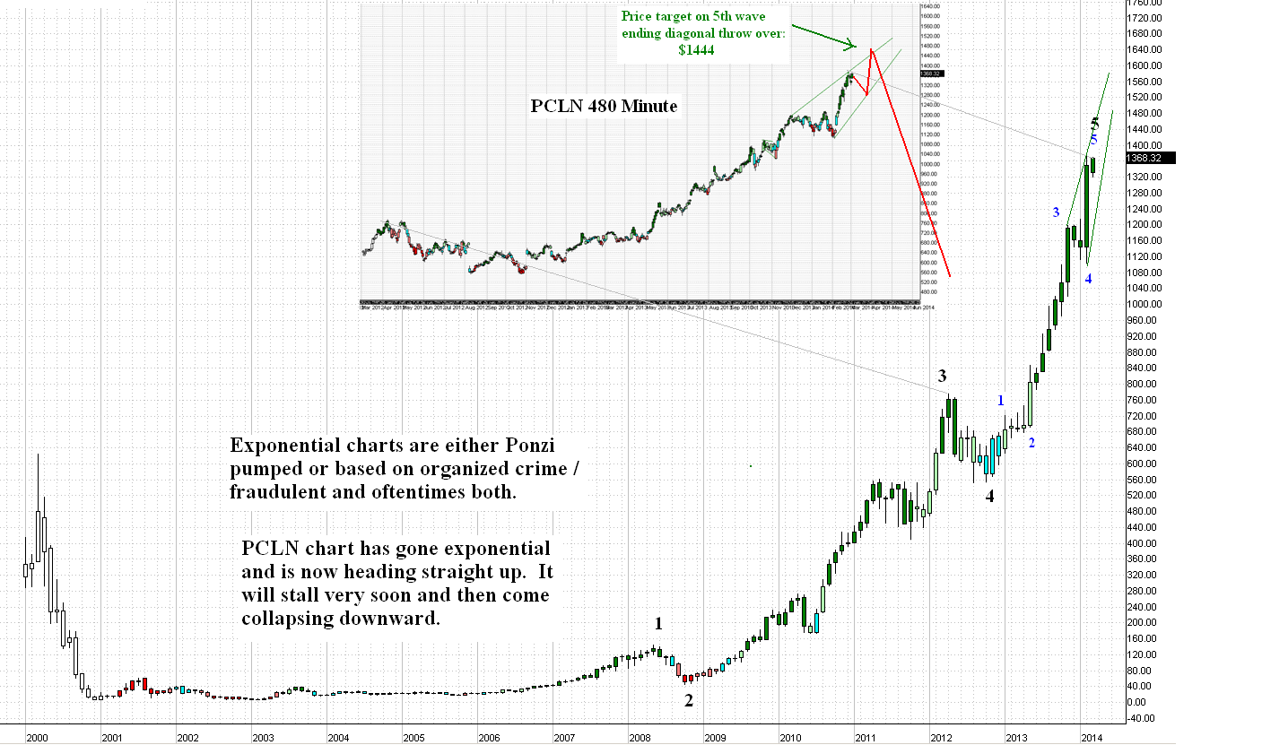
The chart of PCLN shares is now headed straight up. The gamblers are playing chicken with the share price. Anyone buying deep out of the money Jan2016 leaps (puts) on this once it finishes its 5 waves up is going to do very well on them. The inset of the chart below shows just the tip of the 3rd wave, all of the 4th and all of the 5th so far. The model in red suggests that the shares stay elevated until a Walk Away In May sell off begins. I think a reversal to the bottom of the channel begins very very soon, perhaps within 1-2 trading days and it should last at least 2 weeks leading to a loss of about 110-120 points. If it doesn't bounce at that point, the chances wane rapidly that this is an ending diagonal which would mean that it had already peaked.
The following I will say in general. It does not have to do with PCLN company, its shares, its management or its investors. I'm sure these are all fine, upstanding folks. However if I saw any other chart of any other company except PCLN, I'd guess there was some kind of fraud at play and that it went pretty deep not only in the company but in the investors and the regulators and, well, anyone who ever had anything to do with it. I would say that this is a mania chart that will eventually collapse down to nearly zero within 5 years. I would say the books are cooked, that lawsuits will be coming and that bankruptcy is the most likely outcome.
Of course, PCLN is different, I am sure of that. No fraud or cooked books here, no sir. They would not do that so don't even think about it for one second. But everyone else with a chart like that probably had to be doing something illegal to get that kind of shape to the chart.


2 comments:
Thanks Captain - you are the man! Been following your posts since the Yahoo message board days. The PCLN chart is unreal and similar to the Dutch Tulip Mania charts of the 1630's. This time it's different though, right?....
-J.T. Marlin
In any other universe, the entire global debt Ponzi would be considered a Boiler Room operation.
Post a Comment