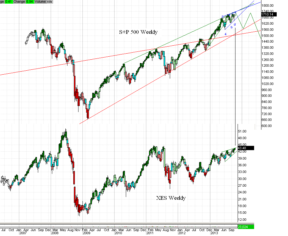
If this is the top for XES then it will form a very powerful double top (owl's ears) and perhaps even a declining double top. Changing the chart's vertical scale for XES shows the double top more clearly. Look at the pathetic volume since mid year. If the stock turns down and then falls below the lower green support line of the ending diagonal accompanied by a big increase in volume then you can surmise that the big boys are running for the door. I don't think XES will be going down alone. Maybe the collapse will include stocks and bonds. Maybe it will be a full on Prechter "it's all one market" meltdown that takes precious metals down as well. Nobody knows for sure how the panicked herd will react.
Note: I think the ending diagonal view of XES has to be reconsidered if the shares hit $46. It's all about odds and nothing is certain. But if you play the odds better than the next guy for long enough you end up with all the chips sooner or later. This is probably why you will end up with no chips and the pros at JP Morgan and Goldman Sachs will have them all. Sometimes the best bet is to simply save your money (in gold and silver of course), and just avoid the market casino altogether.


No comments:
Post a Comment